
Since the great success of Berita theme, I have decided to release its successor – Responsive. This is the most advanced, mobile friendly theme you can imagine. It has it all, HTML5 and sheer simplicity to make any of your designs quickly fit into theme framework. It is versatile business theme with a fully responsive layout and media files. All you need is to activate the theme and your site is ready for business.
More Details | Free Download | Live Preview | Go Premium
Fully Responsive Design

Design and the whole structure of this theme is built to scale on all browser widths/resolutions and on all mobile devices, along with different screen size. Dimensions are specially developed to fit tablets and smart phones. Now go ahead and resize your browser window to see the results.
Developed with HTML5

Theme has been built using the latest HTML5 standards, the fifth edition of HTML. It will work perfectly with the latest browsers and will fully embrace the forthcoming browser innovations. Elements, such as
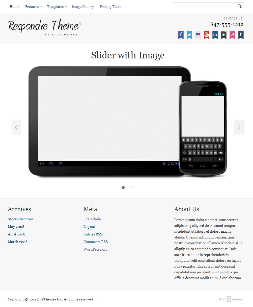
Flexible Slider

Theme uses FlexSlider, the best responsive jQuery slider around. It is built to serve the newest of beginners, while providing seasoned developers a tool they could use with confidence. Responsive web design can be tricky, but I hopefully this slider will serve to uncomplicate the process, just a little bit.
Custom Templates

Add custom pages like Blog, Sitemap, Archives or choose No Sidebar page template if you want to display your page content with sidebar in full width. This is really easy to manage, so you shouldn’t have any problems with it.
Translation Ready
All theme options and texts are easy to translate into any language you want. We made sure theme options are also translatable, so you if you are developing a site for you clients in language other than English, you won’t have any trouble.
9 Alternative Colour Styles
You may style your site however you want, however, we included 15 predefined skins to choose from. Match your brand design with one click and use simple design editor to style the rest (fonts, colors, backgrounds, borders,…).
Full Theme Preview:

Scott H.
13 years ago
It’s really foolish to not have a “responsive” style theme. If webmaster pay attention to their analytics data they will find that a growing number of visitors came to their site due to use of mobile devices or tablets. Perhaps even more important is to go easy and light on advertisements in these instances because on a tablet or mobile device they will take up the majority of the page and appear incredibly ugly!