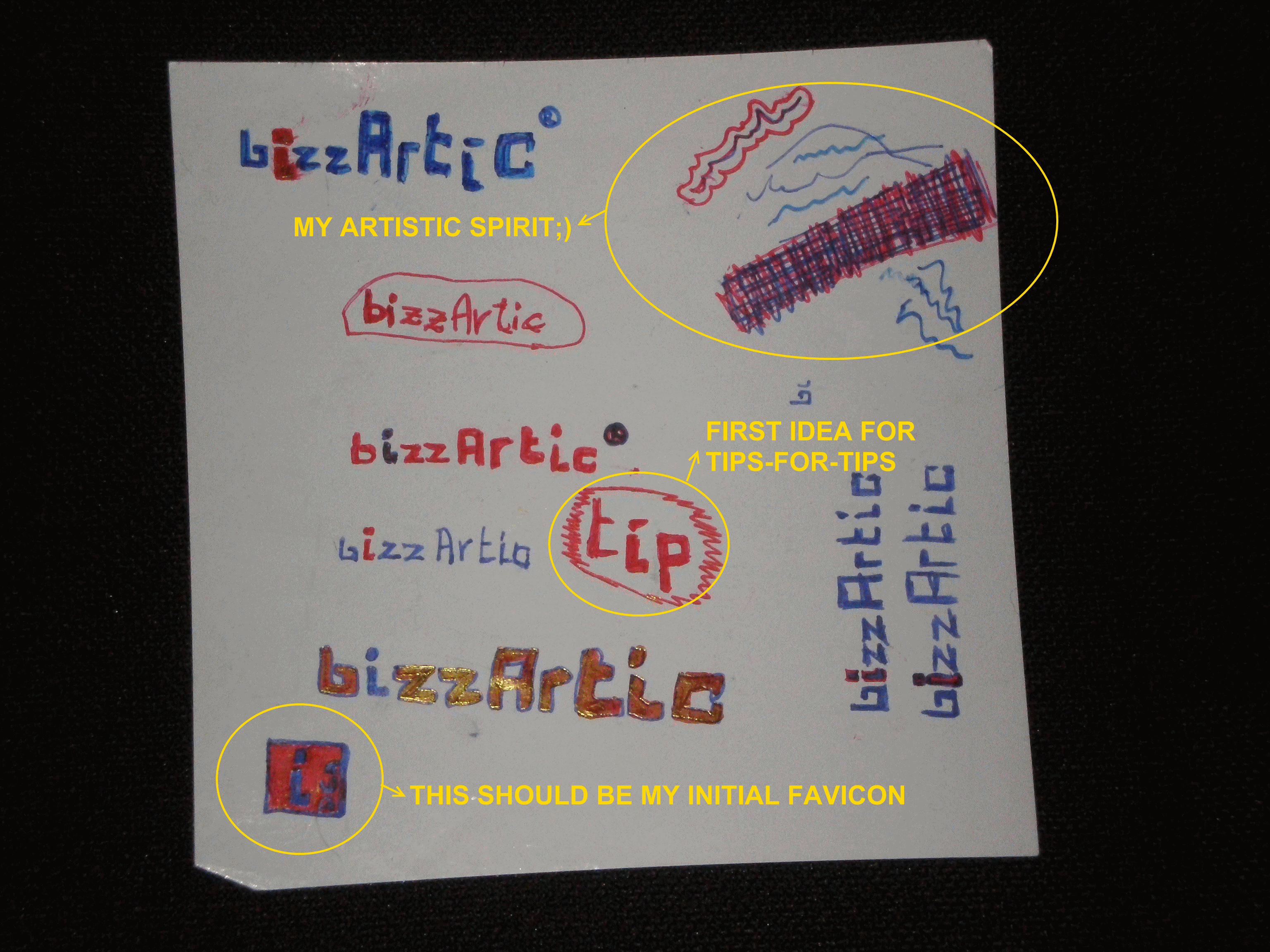
I personally think my logo is now looking quite nice, but in order for you to get full point of view (it also rhymes:) what work was behind it, I’ll paste a few snapshots from my hand-drawn ideas and design drafts.
After that I’ll also paste some comparative images to show how my bizzArtic logo got darker after finding just the right color to match my eyes…
Original image by: ijustine
*


